

The New American Airlines Livery

January 6th, 2014
IN MARCH, 2013, American Airlines unveiled its first major identity change in forty-plus years. The news broke as the carrier prepared to emerge from bankruptcy and prepared for its merger with US Airways.
American had bucked more than three decades of design fads. It’s distinctive silver skin, tricolor stripe and gothic “AA” logo dated back to the days of the its 707 “Astrojets.” Heck, my first ever airplane ride, in 1974, was on an American 727 decked out in the very same paintjob that, until last year, was American’s signature.
It was never anything beautiful, but what distinguished it was the logo — the famous “AA,” its red and blue letters bisected by the proud, cross-winged eagle. This was one of the last true icons of airline branding left in the world. Created by Massimo Vignelli in 1967, it was everything a logo should be: elegantly simple, dignified, and instantly recognizable.
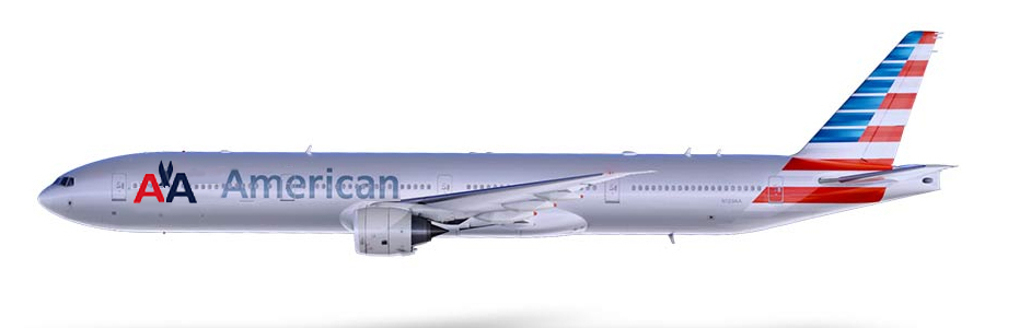
The redesign features a U.S. flag motif tail, a faux-silver fuselage, and an entirely new logo that is so unspeakably ugly that it nearly brings tears to my eyes.
The logo — the trademark, the company emblem, to be reproduced on everything from stationery to boarding passes — is the heart of an airline’s graphic identity, around which everything else revolves. It has been said that the true test of a logo is this: can it be remembered and sketched, freehand and with reasonable accuracy, by a young child? The Pan Am globe, the Lufthansa crane, the Delta tricorn, Air New Zealand’s “Koru” and many others meet this criterion beautifully.
As did the AA emblem. Maybe they need a tweaking or two over time, but the template of such logos — the really good ones — remains essentially timeless. American Airlines had one of the really good ones. And if you’ve got something like that, you dispense with it at your peril.
I was at Kennedy Airport recently and had the opportunity to view several American Airlines jets — some in the old paintjob, others in the new one. I’m sorry, but there was nothing old or anachronistic looking about the AA emblem. It did not need to be “refreshed,” or “modernized,” as some have suggested. Particularly if you’re replacing it with something so utterly vapid.
What exactly is that new, Greyhound Bus-esque logo? It looks like a linoleum knife poking through a shower curtain. If it’s not the worst corporate trademark the airline business has ever seen, I don’t know what is. I can’t imagine a kid with crayons trying to sketch it. Why would anybody want to? It evokes nothing, it says nothing, it means nothing. It gives American Airlines all the look and feel of a bank or a credit card company. I cannot believe how awful a mark this is, and how anybody signed off on it I’ll never understand.
Its uglier, even, than the hideous Horus head of the new EgyptAir. It’s uglier, even, than the “rising splotch” that Japan Airlines came up with a few years back to replace its beautiful tsurumaru — the circular, red and white crane/Rising Sun it had used since 1960 (and which, by the way, JAL has wisely resurrected).
I’m hardly the only person put off by the new branding. It was controversial from the start, and among those who hated it most were thousands of American’s own employees. Finally, last month, CEO Doug Parker put things to a vote, allowing the carrier’s employees to choose between the new look, or a quasi-retro design that incorporated both the old and new schemes.

By a margin of about 2,000 votes, of some 60,000 cast, workers chose to stay with the new look.
Parker says he is happy about the result. But if he got what he wanted, that’s probably because the vote was effectively rigged. Parker won by making the airplane’s tail the focus of the vote. This misses the point, because like it or hate it, the piano key tail isn’t really the problem. It’s the logo that’s the problem. Neither of the choices dealt with the linoleum knife. In fact, Parker’s retro design would have kept both logos in use — a ridiculous, half-baked appeasement that would have left the plane looking manic and jumbled. A company can’t have two logos.
The smarter compromise would have been, and should have been, to keep the new tail, but dispense immediately with the linoleum knife and put the “AA” on the fuselage, as shown below courtesy of yours truly and Photoshop. Had this option been put to a vote, I suspect it would have won by a healthy margin:
To be clear, I’m not arguing that American didn’t need a spruce-up. The striping and typeface were overdue for a revision, and livery changes are all but mandatory, it seems, when airlines exit bankruptcy. But I can live with the tail and with the faux-silver body paint. Doing away with the AA symbol, however, was a tragic and unspeakably bad call.
Each time one of American’s newly painted planes taxis past me, I wince.
RELATED STORIES:
The Yin and Yang of Airline Identity, part 1.
The Yin and Yang of Airline Identity, part 2.


Leave a Comment
Maximum 1500 characters. Watch your spelling and grammar. Poorly written posts will be deleted!
3 Responses to “The New American Airlines Livery”
You are viewing newest comments first. Click to reverse order
When I search for livery pages using the searchspace in your grrrreat site I dont get a list of all your livery entries. Anywho, I came across this and thought it might be of interest: https://www.reddit.com/r/aviation/comments/1sc61s9/whatre_yalls_top_picks_for_currentday_liveries/
I really like this suggestion. I agree that while the “party tail” is growing on me, the flight symbol is too decapitated, I like your idea much better, Perhaps painting the “American” in blue or red.
1. Does it leave on time? Important.
2. Does it get me where I want to go? Important
3. Does it arrive on time? Important
4. What color is the airplane? Not important.
Because we are discussing and possibly arguing about number four it is pretty clear that for the most part American and others are taking care of one, two and three pretty well.
But it’s still fun.